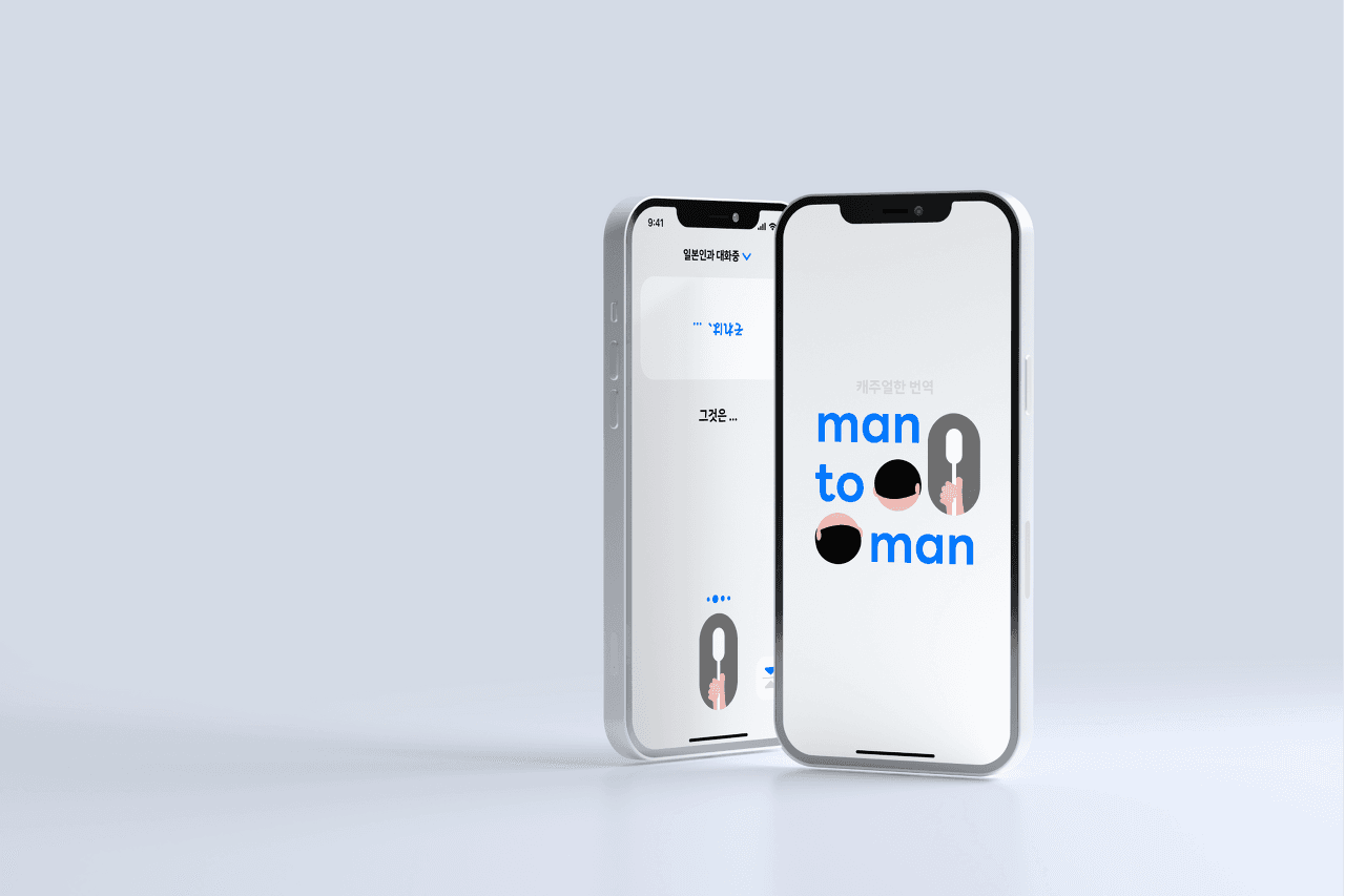
Man-to-Man is an interactive translation app that was developed by myself and a fellow developer during an 8-night, 9-day trip to Japan to address communication issues we personally faced. It was a project where we assumed product ownership, conducted user testing, and iterated on product improvements multiple times. Here, I will explain how we repeatedly enhanced the design through numerous failures.
Background
During our trip to Japan, we quickly realized the limitations of popular translation apps like Papago and Google Translate when it came to actual communication, since we had no knowledge of Japanese. This was not just our problem—many people prefer independent travel abroad where conversations with locals are often necessary. Despite the existence of highly developed translation tools, 45% of travelers still worried about language barriers. There were genuine communication difficulties in hotel check-ins, unexpected situations, asking for directions, making requests, and ordering from menus. Upon returning to Korea, my teammate and I agreed on the same issues and set the goal to create an 'interactive translation app for smooth communication.'
Market Analysis
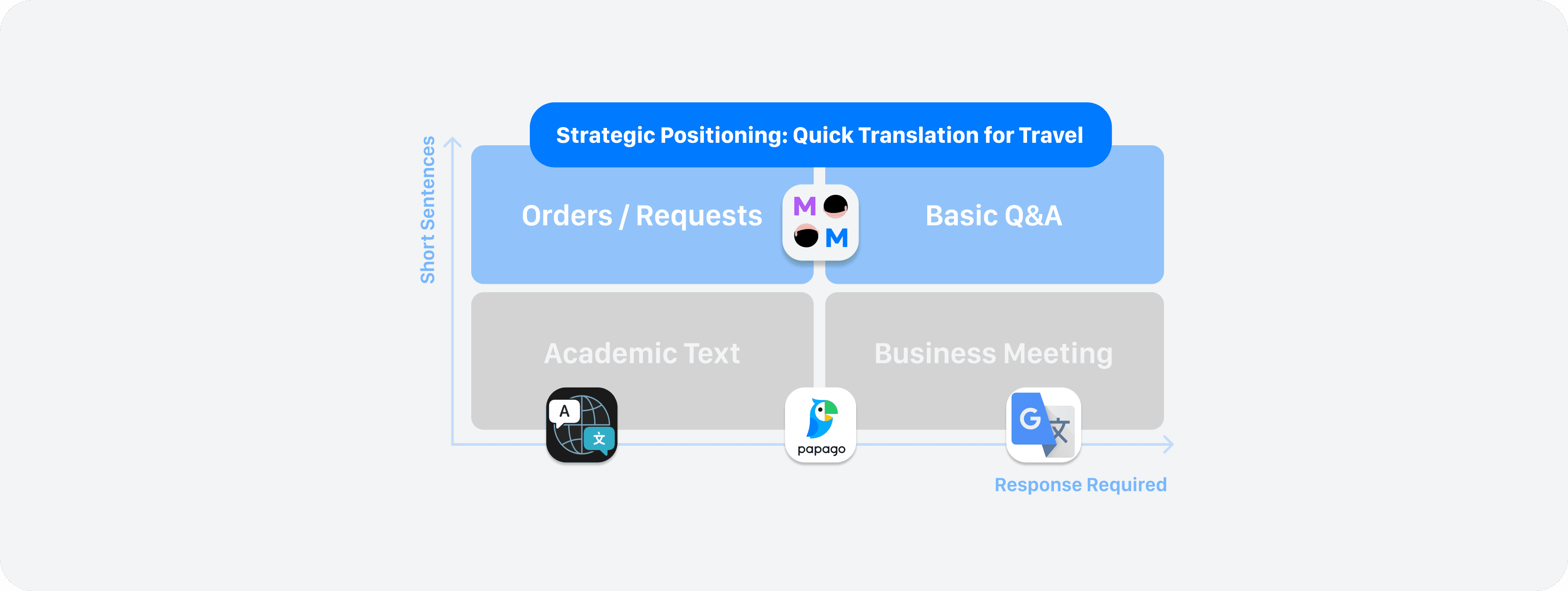
The main translation apps used today include Papago, Google Translate, and Apple Translate. However, they are inadequate for casual conversations with foreigners during travel. Papago was named the most excellent translation app because it excelled in 'language learning,' 'academic paper writing,' and 'meeting preparation.' The reviews for Google and Apple Translate, though rated above 4 stars, predominantly focused on academic translations and word learning.
In short, current translation apps are tailored more for translating lengthy academic texts.
We positioned our service as a translation app that caters to short conversations frequently used during international travel.
Problem
What exact problems were present when using current translation apps in travel conversations?
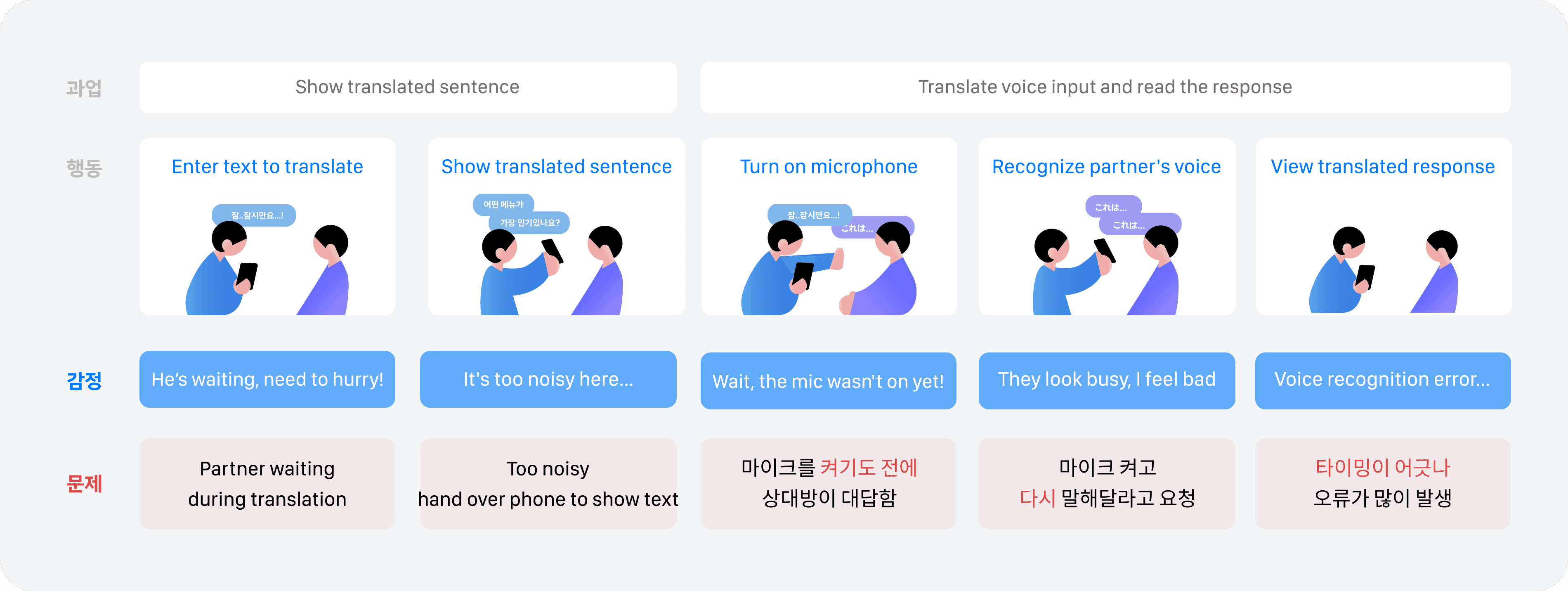
Conversations in travel settings are often conducted in noisy environments. Typically, the first step is to input the words to be translated into text before showing the translated output to the other person. The counterpart would then respond immediately in a foreign language, often speaking before the microphone is activated, causing frequent voice recognition errors. This resulted in an inefficient cycle of asking the counterpart to repeat themselves, and when it was back to my turn, the counterpart had to wait while my words were being translated.
Essentially, translation itself was disrupting the timing of conversations.
Translation apps couldn’t keep up with the fast-paced back-and-forth of conversations, known as ping-pong. The user would need to operate the app when they spoke, and the counterpart would need to use it when they spoke, necessitating the exchange of a single phone back and forth.
Hypothesis
What if two people could converse by looking at the same app screen? This led us to the following hypothesis.
“If people face the app screen for translation, the flow of conversation won't break.”
Facing the app screen would eliminate the need to pass the phone around. Therefore, we could reduce unnecessary steps between the user's speech and the counterpart's response, allowing for smooth conversational ping-pong.
To validate this hypothesis, we needed measurable indicators that show the conversation flow wasn’t interrupted. By simulating real conversational scenarios with foreigners and reviewing videos of travel conversations on YouTube, we determined indicators such as “average response time intervals of 5 seconds or less” and “at least 3 consecutive exchanges” to reflect rapid turnaround times. We believed achieving these benchmarks would indicate the translation app is effectively facilitating conversation.

Solution
For two people to look at one app screen and converse, each required a view of their respective translation windows. We designed it so that in rapid-turnover situations, the counterpart's speech would show real-time translations in my window, and my speech would be readable in the inverted translation window for the opposite side. We created this double-sided viewing structure within a single screen.
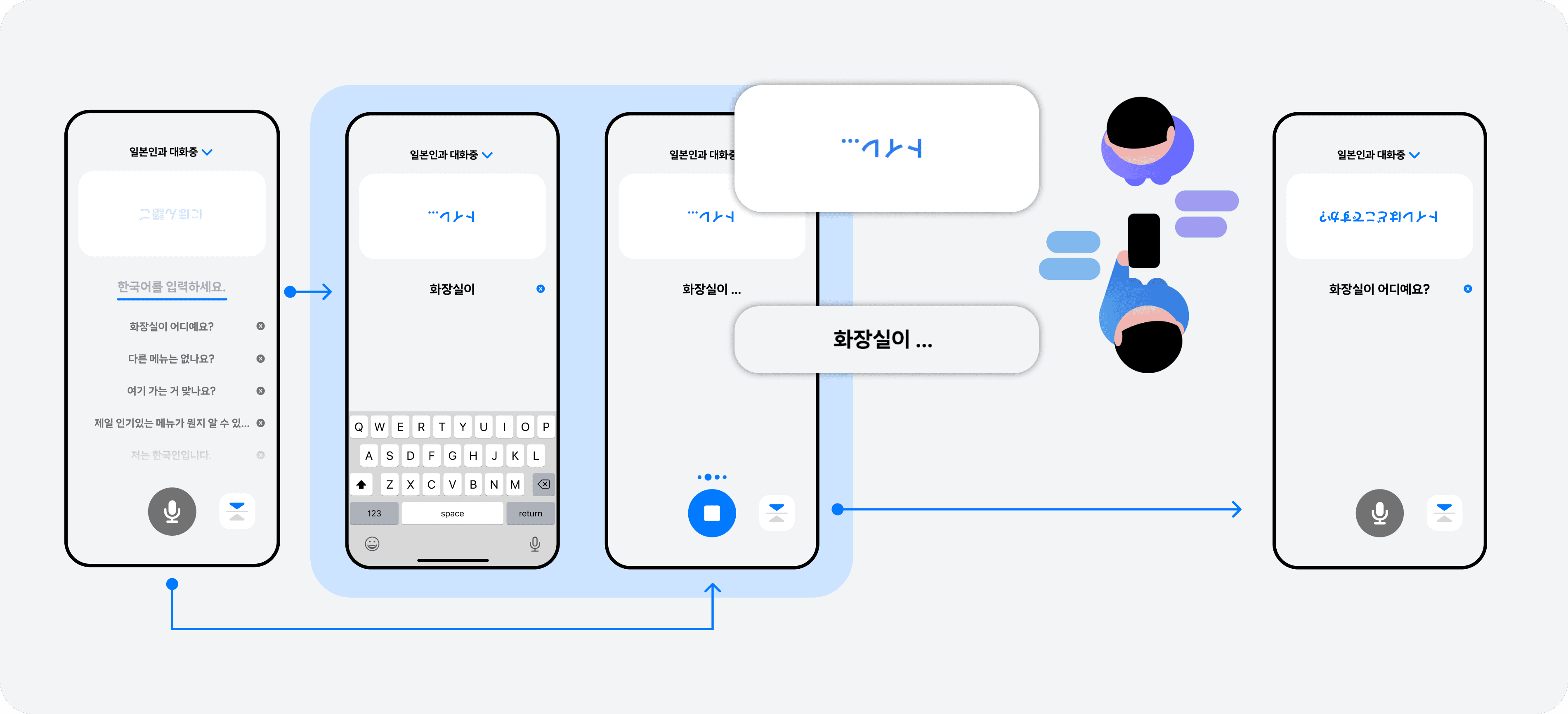
We also limited the app's operation to one person. If both tried to control a single phone, timings would get messed up.
Accordingly, we placed the button to flip the counterpart's translation window and a button to activate the counterpart’s microphone at the bottom so they could be quickly accessed and used by the user in sync with the conversation flow, rather than on the other side.
We also developed a way to quickly activate the microphone in line with the counterpart's speaking turns.
Initially, we wondered if one microphone could distinguish between the user's and the counterpart's speech, removing the need for two microphones. However, considering the situation of being a solo developer, we had to devise a design solution. At this time, we recalled the multifunctional button approach of the iPhone's default camera app. A button’s click would take a photo, a swipe to the side enabled continuous shooting or video recording.

In the Man-to-Man app, we allowed the dual use of a single microphone button for recognizing both my speech and the counterpart’s speech. As mentioned earlier, due to timing issues, one user leading the conversation had to operate the app. We wanted users to experience this dual functionality through button interaction by demonstrating the real action.
If there was only one microphone, realistically, it would be passed to hear the counterpart’s speech. In the app, this handing-over of the microphone was represented by dragging it upwards, activating the counterpart's microphone. We made the microphone lengthen and symbolize a handover action when dragged, designing an intuitive button interaction.

Results
After quickly planning, designing, and developing the Man-to-Man app in just two weeks, we launched it and monitored responses through promotions on Disquiet, travel communities, and Instagram. The app, which allows face-to-face conversation, garnered interest, attracting 100 users within a month. In particular, there were over 90 comments in travel communities, with many expressing intentions to install the app as it was seen as useful for actual travel. Seeing users agree with the app's necessity and appreciate it filled us with pride and happiness, helping us realize the professional value we can offer.

User Testing
Post-launch, we conducted user testing with three missions to closely listen to user feedback on the main functions.
A mission to input and show translated questions to verify the 'face-to-face conversation' main feature. (3 out of 5 participants failed)
A mission to translate and read out aloud given counterpart's speech to observe effective use of the counterpart’s microphone feature. (4 out of 5 participants failed)
Testing the usage of recent records and translating with different languages to observe effective use of auxiliary features. (4 out of 5 participants succeeded)
Among the many issues discovered while using the app, two major issues significantly impacted our hypothesis validation metrics.
Users failing the first mission, where they show translated questions to counterparts, did not recognize the button to flip the counterpart's translation window. This button effectively doubled the functionality that users could operate, consequently causing confusion in the face-to-face conversation feature, preventing proper validation of this functionality.
Moreover, users who failed the second mission, translating the counterpart's voice, were unsure how to operate the counterpart's microphone. They either lacked awareness of needing to operate the feature differently or failed to consider dragging the button. Consequently, the number of exchanges that involved mutual translations never exceeded two.

Improvement 1
First, to verify the face-to-face translation feature, we needed to improve the flip functionality.
We discovered that users misunderstood the flip button as a voice recognition-related function due to its proximity to the microphone button. 50% of users associated the flip button with the microphone due to an error in association caused by the 'proximity principle.'
The first attempt to resolve this was discovered through observing user behavior in multiple UT sessions. We noted a common action among users facing each other to share the translation screen—tilting the phone towards the counterpart. This prompted the automation of flipping the counterpart's translation window without the user needing to press a button. We modified the app to automatically flip the counterpart's translation window when the phone was tilted around 45 degrees or more.
Additionally, previously users could skip through onboarding just by reading, which resulted in them not thoroughly learning actions. This time, we enabled users to experience flipping by tilt through interactive onboarding instead of merely reading instructions.
Improvement 2
The second issue was users struggling to utilize the counterpart's voice recognition function. One reason for users' inability to use this function, discovered during UT, was their failure to conceptualize the counterpart's microphone function as separate from their own microphone.
First and foremost, we needed to help users intuitively differentiate between their speech and that of the counterpart’s. Through UT, we experimented with various approaches, such as using speech bubble shapes and icons for guidance, but the design suggestion receiving the most votes was color differentiation.
Therefore, we used different colors for my speech and the counterpart's speech, adding borders to the currently active translation window to highlight which translation screen was current.
Conclusions
After numerous trials, we conducted UT with the improved design. This time, we simulated a travel scenario as closely as possible, having users and their foreign counterparts communicate using only the Man-to-Man app, without enforcing specific feature-based missions.
The time intervals between translations, our core metrics, decreased to 5 seconds, and the number of transitions between speakers exceeded five times in a row.
This demonstrated the app's capability to differentiate between speakers intuitively, with users able to effectively switch between speakers using two microphone buttons, proving the critical product value was effectively conveyed through persistent usability enhancements. Confidence in the improved design allowed us to release a new version of the app.
Lesson Learned
Being deeply immersed in my design, I often got accustomed to it and forgot to consider the user perspective, mistakenly assuming that users would naturally understand and use it. Through the Man-to-Man app, I was continuously engaging with users and conducting as many usability tests as possible, forcing me to view my product with a fresh perspective. Observing users during tests not only revealed smoother, more streamlined processes but also generated ideas for further refinement.
Designing with a user-centric mindset is crucial and cannot be overemphasized—a lesson this project reinforced.
